Why it took months to add drawing to Did It, and what changed.
When I started Did It I wanted three kinds of entry: text, photos and sketches. Text came first, photos followed, sketches didn’t, and for a good while I couldn’t say why beyond “it’s harder than it looks”.
Why it stalled
Earlier this year I tried to get a sketch feature working on both iPhone and Android. Every attempt went the same way. The interface got complicated, the drawing was buggy, and I couldn’t say what the sketch was supposed to deliver. Some early ideas had sketches becoming a background anchored to a day. Others had them attached to individual entries. Each choice added complexity and hid the benefit.
Looking back, that last problem is the one that mattered. I hadn’t decided what a sketch was for, so I parked it.
What changed
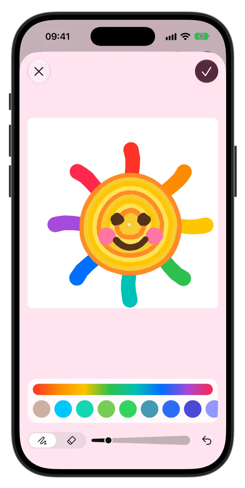
Recently I saw how ChatGPT lets you sketch a draft for an AI image. It’s a simple sheet with a canvas and very little else. It was exactly the kind of restraint my attempts had lacked, so I leaned on that design. Newer coding models also made the cross-platform drawing work far better than it had at the start of the year. I could now give the models a clearer, much narrower brief.
That gave me a respectable sketch sheet on both platforms. Then I added one flourish. When you save a sketch, it turns into a sticker that sits on the day. The app treats sketches like photos, but keeps the stroke data alongside the image so they stay editable.
Will it be useful? I’ll give it some time and seek feedback. The idea is now out there for all Did It users to play with. I expect they’ll have clearer ideas for how it should evolve.
What I took from it
Two things. First, a feature with no purpose is hard to build however good the tools are, and it took me far too long to see that the tools weren’t the blocker. Second, borrowing a good interaction from a product that does something different is fine, as long as you then give it a job of your own. Here the job is a sticker on a day.