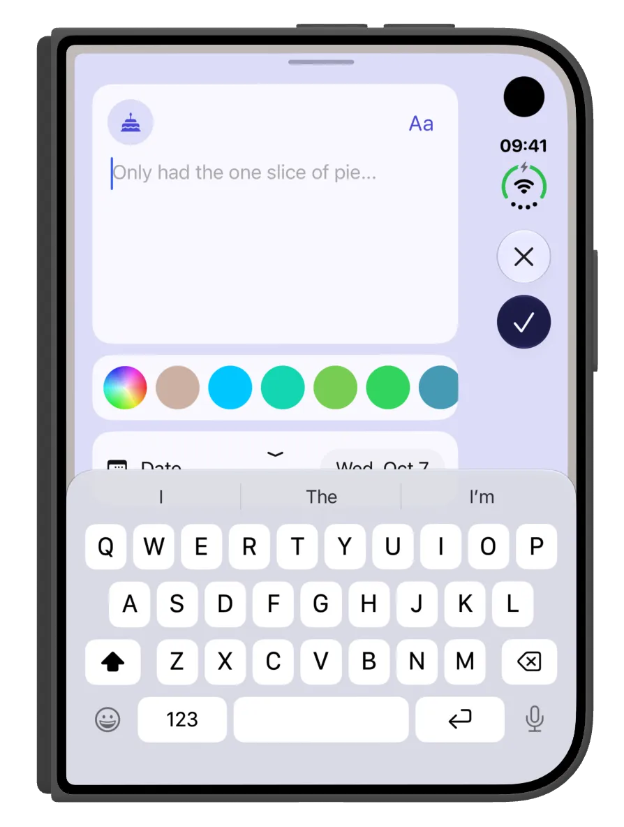
A small redesign of the entry sheet that started with where the buttons sit.
While redesigning Did It for the Duo, I looked again at the text entry sheet. It had a cancel icon and a text button saying Add. They weren’t part of a native menu bar, so they sat at the top of the sheet. On the Duo, buttons are meant to sit to the right to leave more vertical space, and mine didn’t.
What I changed
I rebuilt the header as a native menu. I also swapped the Add text for a checkmark icon, the one Apple uses across the OS to mean done. It’s the more common choice, though I’d argue it’s less obvious than a word. On the Duo, close and done now sit on the right, where they belong.
The knock-on problem
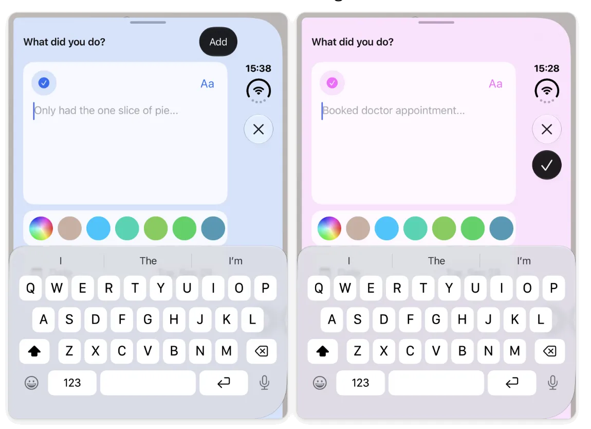
That caused a second issue. Did It’s default entry icon is a checkmark, and it only changes once you start typing. With a checkmark in the header as well, two checkmarks on one sheet was confusing.
So I made the entry icon change along with the placeholder text as it cycles through its suggestions. The icon now changes before you type anything, and the checkmark in the header is the only one.
One more touch
I had set the Done button to the primary filled colour to lift it above Close. I then matched it to the entry’s own colour, so it follows the icon as that changes.
I shared comparison images like these with a couple of people along the way, and that helped me feel confident about dropping the text label.
Where it ended up
The entry sheet now looks like it belongs on the Duo. I think it looks best in the smaller closed pose. At the very end I also removed the “What did you do?” heading. On reflection it sounded way too accusatory, and the sheet doesn’t need it.